Since we already learned about visual controls, their properties, events, and so on, it is time to learn the list of available controls for designing our graphical user interfaces. Note that the list is presented in alphabetical order, not by the importance of the controls, nor by the frequency of which they are used.
 POINTER – At the top of Visual Studio Toolbox, you will find “Pointer” In reality, this is not actually a visual control that can be added to windows. Whenever you click on a control in Toolbox (other than Pointer) and hover your mouse over the surface of your Window, you will notice that your mouse cursor has been changed to a “drag” one, and if you click anywhere on the surface of your window, the selected control will be placed at that location. You don’t have to hold down any keys to do the actual drag. But there may be times when you accidentally click on a control in Toolbox list, or you changed your mind and don’t want to add a control anymore. In such cases, you can click on this “Pointer” element in the list, which will revert your mouse cursor to the normal one, and prevent any accidental control adding to your window.
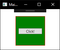 BORDER – The Border control is a Decorator control that you may use to draw a border, a background, or even both, around another element. Since the WPF panels don’t support drawing a border around its edges, the Border control can help you achieve just that, simply by surrounding e.g. a Panel with the Border control. The Border is completely lookless until you define either a background or a border brush and thickness, using the Background, BorderBrush and BorderThickness properties. The image shows a Button control inside a Border which has a red border and a green background.
BUTTON – We know the Button control to be the most well known and most used control in pretty much any interface. It’s behavior is quite obvious, it is executing a piece of code whenever we click it with the mouse. The default property of a button is Content. It’s default event is Click.
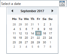
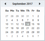 CALENDAR – A calendar control is used to create a visual calendar that lets users pick a date by using a visual calendar display, and fire an event on the selection of the date. It provides some basic navigation facilities using either the mouse or the keyboard. The SelectedDate property represents the currently selected date. The SelectionMode represents the selection mode of calendar. If multiple dates selection is true, the SelectedDates property represents a collection of currently selected dates. SelectionMode can have 4 values: None (no selections are allowed), SingleDate (only a single date can be selected, either by setting SelectedDate or the first value in SelectedDates; AddRange cannot be used), SingleRange (a single range of dates can be selected; setting SelectedDate, adding a date individually to SelectedDates, or using AddRange will clear all previous values from SelectedDates) and MultipleRange (Multiple non-contiguous ranges of dates can be selected. Adding a date individually to SelectedDates or using AddRange will not clear SelectedDates. Setting SelectedDate will still clear SelectedDates, but additional dates or range can then be added. Adding a range that includes some dates that are already selected or overlaps with another range results in the union of the ranges and does not cause an exception). The BlackoutDates property of the Calendar class represents a collection of dates that are not available for selection. All non-selection dates are marked by a cross. The Calendar control allows you to set the start and end display dates using the DisplayDateStart and DisplayDateEnd properties. DisplayDate property represents the current date to display. By default, Sunday is the first day of the week. If you would like to change it, you use the FirstDayOfWeek property. The IsTodayHightlighted property is used to highlight today. Besides the normal control events, the Calendar control has three calendar related events, DisplayDateChanged, DisplayModeChanged and SelectedDatesChanged. The DisplayDateChanged event is fired where the DisplayDate property is changed. The DisplayModeChanged event is fired when the DisplayMode property is changed. The SelectedDatesChanged event is fired when the SelectedDate or SelectedDates properties are changed.

BlackOut dates
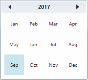
DisplayMode year
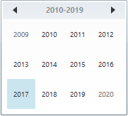
DisplayMode decade
CANVAS – The Canvas is probably the simplest Panel of them all. A Panel is a control which is only visible at design time (it becomes invisible at run time) and has no other functionality other than holding controls inside it, like a container, grouping them in some way. As such, a canvas doesn’t really do anything by default, it just allows you to put controls in it and then position them yourself using explicit coordinates. If you have ever used another UI library like WinForms, this will probably make you feel right at home, but while it can be tempting to have absolute control of all the child controls, this also means that the Panel won’t do anything for you once the user starts resizing your window, if you localize absolutely positioned text or if the content is scaled. This means that if you place two button controls inside a canvas, without specifying any positioning properties, they will be displayed one on top of the other, in the top left corner of the canvas. This is done using the Left, Right, Top and Bottom attached properties from the Canvas control. These properties allow you to specify the position relative to the four edges of the Canvas. By default, they are all set to NaN (Not a Number), which will make the Canvas place them in the upper left corner, but as mentioned, you can easily change them.
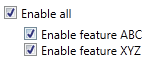
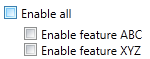
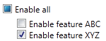
 CHECKBOX – The CheckBox control allows the end-user to toggle an option on or off, usually reflecting a Boolean value in the code-behind. The IsChecked property represents the state of the CheckBox control. The CheckBox control inherits from the ContentControl class, which means that it can take custom content and display next to it. If you just specify a piece of text, WPF will put it inside a TextBlock control and display it, but this is just a shortcut to make things easier for you. You can use any type of control inside of it, including links, images, etc. The IsThreeState property represents whether the CheckBox has two or three states. The three states are checked, unchecked and indeterminate. As mentioned, the CheckBox usually corresponds to a boolean value, which means that it only has two states: true or false (on or off). However, since a boolean data type might be nullable, effectively allowing for a third option (true, false or null), the CheckBox control can also support this case. By setting the IsThreeState property to true, the CheckBox will get a third state called “the indeterminate state”. A common usage for this is to have a “Check all” CheckBox, which can control a set of child checkboxes, as well as show their collective state, allowing you to have both checked and unchecked items. The most common events of the CheckBox control are Checked (occurs when you check the checkbox), Unchecked (it fires when you uncheck the checkbox) and CheckChanged (which fires when you both check or uncheck the checkbox).
Checked
Unchecked
Indeterminate
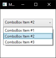 COMBOBOX – The ComboBox control is in many ways like the ListBox control (see below), but takes up a lot less space, because the list of items is hidden when not needed. Unlike a ListBox control, a ComboBox does not allow multiple item selection. As with many other WPF controls, XAML allows us to use other controls as ComboBox items (images, links, buttons, etc). Obviously, there will be times when you won’t know beforehand the list of items that will populate Combobox. In such cases, you can use the ItemsSource property, as well as the Add method of the Items property of ComboBox. SelectedItem is a property that can be used to get or set the selected item inside a ComboBox. One of the cool things about the ComboBox is that it supports the possibility of letting the user both select from a list of items or enter their own value. This is extremely useful in situations where you want to help the user by giving them a pre-defined set of options, while still giving them the option to manually enter the desired value. This is all controlled by the IsEditable property, which changes the behavior and look of the ComboBox quite a bit. The most useful event of the ComboBox is SelectionChanged, which occurs when the user changes the selected element.
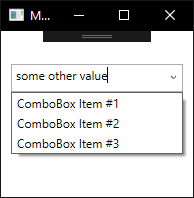
IsEditable true
CONTENTCONTROL – Content Control is a base class that provides standardised functionality to WPF Controls. The Content Control class represents controls that can include a single item of content. This content is commonly plain text or a child control. Content Control is a subclass of the Control class in WPF.
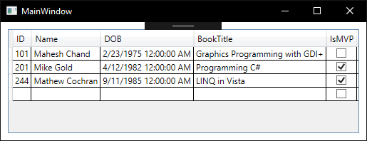 DATAGRID – The DataGrid control looks a lot like the ListView one (see below), when using a GridView, but it offers a lot of additional functionality. For instance, the DataGrid can automatically generate columns, depending on the data you feed it with. The DataGrid is also editable by default, allowing the end-user to change the values of the underlying data source. The most common usage for the DataGrid is in combination with a database, but like most WPF controls, it works just as well with an in-memory source, like a list of objects. Just like for the ComboBox control, the ItemSource property of DataGrid is the key to data binding, though items can be added manually too. If you do not wish to generate automatic columns, you simply need to set AutoGenerateColumns property to false. The ColumnWidth and RowHeight properties of DataGrid are used to set the default column width and row height of DataGrid columns and rows. The MaxWidth and MaxHeight properties represent the maximum width and maximum height of a DataGrid. The MinWidth and MinHeight properties represent the minimum width and height. The MaxColumnWidth and MinColumnWidth properties represent the maximum width and minimum width of columns in a DataGrid. The GridLinesVisibility property is used to make grid lines visible. Using this option you can show and hide vertical, horizontal, all, or none lines. The HeaderVisibility property is used to show and hide row and column headers. The Background property is used to set the background color of the DataGrid. The RowBackground and AlternativeRowBackground properties are used to set the background color of rows and alternative of the DataGrid. The IsReadOnly property is used to make a DataGrid read only. That means you cannot edit a DataGrid. The AreRowDetailsFrozen property is used to freeze the row details area so it cannot be resized. The FrozenColumnCount property represents the number of columns that user can not scroll horizontally. DataGrid allows you to reorder columns by dragging a column but you may disable this feature by setting the CanUserReorderColumns property to false. Data Grid allows you to change the width of columns. You may fix columns so user can’t resize them by setting the CanUserResizeColumns property to false. By default, column sorting is enabled on a DataGrid. You can sort a column by simply clicking on the column header. You may disable this feature by setting CanUserSortColumns property to false. The HorizontalScrollBarVisibility and VerticalScrollBarVisibility properties of type ScrollBarVisibility enumeration control the horizontal and vertical scrollbars of the DataGrid. It has four values – Auto, Disabled, Hidden, and Visible. The default value of these properties is Auto, that means, when scrolling is needed, you will see it, otherwise it will be hidden. The SelectionMode property decides if the DataGrid allows only a single row or multiple rows selection. It has two values, Single and Extended. SelectionChanged is the default event of the DataGrid, but there are other important events such as RowEditEnding, SelectedCellsChanged, Sorting, AutoGeneratedColumns, ColumnReordered, etc.
 DATEPICKER – A DatePicker control is used to create a visual DatePicker that let user to pick a date and fire an event on the selection of the date. It looks somehow similar to the Calendar control, with one single notable difference. The DisplayDate property represents the date to display. The default is today. The IsDropDownOpen property indicates if the calendar part of the DatePicker control is open or closed. The Text property represents the text that is displayed in the DatePicker. The SelectedDate property represents the currently selected date. If multiple dates selection is true, the SelectedDates property represents a collection of currently selected dates. The BlackoutDates property of the DatePicker class represents a collection of dates that are not available for selection. All non selection dates are marked by a cross. The DatePicker control allows you to set the start and end display dates by using the DisplayDateStart and DisplayDateEnd properties. By default, Sunday is the first day of week. If you would like to change it, you use FirstDayOfWeek property. The IsTodayHightlighted property is used to make today highlighted. The DisplayDateChanged event is fired where the DisplayDate property is changed. The DisplayModeChanged event is fired when the DisplayMode property is changed. The SelectedDatesChanged event is fired when the SelectedDate or SelectedDates properties are changed.
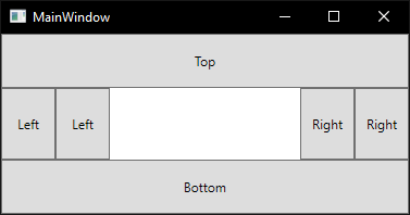
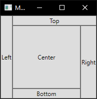 DOCKPANEL – The DockPanel makes it easy to dock content in all four directions (top, bottom, left and right). This makes it a great choice in many situations, where you want to divide the window into specific areas, especially because by default, the last element inside the DockPanel, unless this feature is specifically disabled, will automatically fill the rest of the space (center). As we’ll see with many of the other panels in WPF, you start taking advantage of the panel possibilities by using an attached property of it, in this case the DockPanel.Dock property, which decides in which direction you want the child control to dock to. If you don’t use this, the first control(s) will be docked to the left, with the last one taking up the remaining space. Since the DockPanel control assigns portions of its space to various controls, and since two or more controls could compete over space (should a left control expand all the way to the top, or should a top control expand all the way to the left?), WPF also take into account the order in which the child elements are declared. LastChildFill is the property that will determine whether the last item in list will fill the remaining space or not.
LastChildFill false
 DOCUMENTVIEWER – WPF provides support to work with documents. It considers documents to be classified as either fixed documents or flow documents. You use fixed documents when you want a “what you see is what you get” (WYSIWYG) display. Here, maintaining the original design of a document even after it is rendered in WPF is very important. Scenarios such as desktop publishing, form layout, and so forth will need the use of fixed documents. Flow documents, on the other hand, are primarily used for reading and viewing documents, rather than laying focus on the design and formatting. DocumentViewer control is used to display flow documents, such as XPS files.
ELLIPSE – The Ellipse object represents an ellipse shape and draws an ellipse with the given height and width. The Width and Height properties of the Ellipse class represent the width and height of an ellipse. The Fill property fills the interior of an ellipse. The Stroke property sets the color and StrokeThickness represents the width of the outer line of an ellipse.
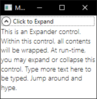 EXPANDER – The WPF Expander represents a control with an expanded view where the contents of the expanded area can be expanded or collapsed. The default view of an Expander control is collapsed. If you click on the header, the expanded view will show up. Most of the time, you would want the header of the Expander control to look different from the contents. This can be done by simply setting the font properties such as FontSize and FontWeight of the Expander control different from the contents. The ExpandDirection property of the Expander control sets the direction of the Header. It can be Up, Down, Left or Right. Expander.Header property may be used to style the header of an Expander control. Within the Header, you can set whatever contents you would like, including an Image. Adding a ScrollViewer control in the contents of an Expander adds scrolling to the Expander. The most important events of the Expander are Collapsed and Expanded.
FRAME – The WPF Frame control using XAML and C# supports content navigation within content. A Frame can be hosted within a Window, NavigationWindow, Page, UserControl, or a FlowDocument control. WPF frame control is capable of displaying both WPF and HTML content.
GRID – The Grid is probably the most complex of the panel types. A Grid can contain multiple rows and columns. You define a height for each of the rows and a width for each of the columns, in either an absolute amount of pixels, in a percentage of the available space, or as auto, where the row or column will automatically adjust its size depending on the content. Use the Grid when the other panels doesn’t do the job, e.g. when you need multiple columns and often in combination with the other panels. In its most basic form, the Grid will simply take all of the controls you put into it, stretch them to use the maximum available space and place it on top of each other. By default, specifying more controls inside a Grid will just lay them one on top of the others, which is not particularly useful. Here, ColumnDefinitions and RowDefinitions properties come handy. With them, you can set individual space for controls, with a well define space amount.
GRIDSPLITTER – As you saw in the above section, the Grid panel makes it very easy to divide up the available space into individual cells. Using column and row definitions, you can easily decide how much space each row or column should take up, but what if you want to allow the user to change this? This is where the GridSplitter control comes into play. The GridSplitter is used simply by adding it to a column or a row in a Grid, with the proper amount of space for it, e.g. 5 pixels. It will then allow the user to drag it from side to side or up and down, while changing the size of the column or row on each of the sides of it. Changing the columns into rows and defining a Height instead of a Width on the GridSplitter, the GridSplitter will figure out the layout and switch to a horizontal GridSplitter, but in case it doesn’t, you can use the ResizeDirection property on it, to force it into either Rows or Columns mode.
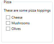 GROUPBOX – The GroupBox element in XAML is used to add a header to an area and within that area you can place controls. By default, a GroupBox can have one child, but multiple child controls can be added by placing a container control on a GroupBox such as a Grid or StackPanel. A GroupBox is a container control. It is not worth much on its own. Instead we add controls inside of it, which may be more interactive with the user. The most important feature of a GroupBox is the header label, which lets us visually group elements under a common category. The Header property will let you set the grouping label at the top.
 IMAGE – It is a control that displays an image. You can use either the Image object or the ImageBrush object. An Image object displays an image, while an ImageBrush object paints another object with an image. The image source is specified by referring to an image file using several supported formats. It can display the following formats: Bitmap (BMP), Tagged Image File Format (TIFF), Icons (ICO), Joint Photographic Experts Group (JPEG), Graphics Interchange Format (GIF), Portable Network Graphics (PNG), JPEG XR. If a file is a multiframe image, only the first frame is displayed. The frame animation is not supported by this class. The Source property of the Image class is the file an image displays. The Source property is a BitmapImage, that can be converted using the following code:
|
1 |
ImageViewer1.Source = new BitmapImage(new Uri("MyImage.jpg", UriKind.Relative)); |
The Stretch property of Image describes how an image should be stretched to fill the destination rectangle. A value of Fill will cause your image to stretch to completely fill the output area. When the output area and the image have different aspect ratios, the image is distorted by this stretching. To make an Image preserve the aspect ratio of the image, set this property to Uniform, that is the default value of Stretch. The StretchDirection property of Image describes how scaling applies to content and restricts the scaling to named axis types. It has the three values UpOnly, DownOnly and Both. The UpOnly value indicates that the image is scaled upward only when it is smaller than the parent. The DownOnly value indicates that the image is scaled downward when it is larger than the parent. The Both value stretches the image to fit the parent. The Rotation property of BitmapImage is used to rotate an image. It has the four values Rotate0, Rotate90, Rotate180 and Rotate270. The FormatConvertedBitmap is used to apply formatting of images in WPF. The FormatConvertedBitmap.Source property is a BitmapImage that will be used in the formatting process. CroppedBitmap is used to crop an image. It takes a BitmapImage as source and a rectangle that you would like to crop. Opacity property can be used to specify the opacity of an image.

Ellipse ImageBrush

Opacity 50%
LABEL – The Label control, in its most simple form, will look very much like the TextBlock (which I will explain further in this lesson), displaying a simple text. You will quickly notice though that instead of a Text property, the Label has a Content property. The reason for that is that the Label can host any kind of control directly inside of it, instead of just text. Another thing you might notice is the fact that the Label, by default, has a bit of padding, allowing the text to be rendered a few pixels away from the top, left corner. This is not the case for the TextBlock control, where you will have to specify it manually. In a simple case where the content is simply a string, the Label will actually create a TextBlock internally and show your string in it. The TextBlock only allows you to render a text string, while the Label also allows you to specify a border, render other controls (e.g. an image), use templated content through the ContentTemplate property, use access keys to give focus to related controls, etc. The last feature point is actually one of the main reasons for using a Label over the TextBlock control. Whenever you just want to render simple text, you should use the TextBlock control, since it’s lighter and performs better than the Label in most cases.
 LISTBOX – Up above in this lesson, we had a look at the ItemsControl, which is probably the simplest list in WPF. The ListBox control is the next control in line, which adds a bit more functionality. One of the main differences is the fact that the ListBox control actually deals with selections, allowing the end-user to select one or several items from the list and automatically giving visual feedback for it. As content, we declare inside of it three ListBoxItem’s, each with its own text. However, since the ListBoxItem is actually a ContentControl, we can define custom content for it (TextBlock, Image, CheckBox, etc). For even more functionality, like column headers, you should have a look at the ListView control, which is given a very thorough description later on in this lesson.
 MEDIAELEMENT – The MediaElement acts as a wrapper around MediaPlayer, so that you can display video content at a given place in your application, and because of that, it can play both audio and video files, although the visual representation doesn’t really matter in dealing with audio files. The cool part about the MediaPlayer class is that it can work with video files as well. However, since a video actually needs to be displayed somewhere in the interface, as opposed to an audio file, we need a wrapper element to visually represent the MediaPlayer instance. MediaElement can stretch/shrink the content to fit the available width/height and will do so by default. This is caused by the Stretch property, which is set to Uniform by default, meaning that the video will be stretched, while respecting the aspect ratio. If your window is larger than your video, this might work just fine, but perhaps you don’t want any stretching to occur. Or perhaps you want the window to adjust to fit your video’s dimensions, instead of the other way around. The first thing you need to do is to turn off stretching by setting the Stretch property to None. This will ensure that the video is rendered in its natural size. The video starts playing as soon as the player has buffered enough data, but you can change this behavior by using the LoadedBehavior property. The Source property sets the audio or video source to be played (can be local, embedded or even online media). MediaElement has three useful methods that you can use in code behind: Play(), Pause() and Stop(). In regard to the media file itself, you have few useful properties such as Balance (audio channel panning), IsMuted, Position, Volume, etc. Few events that are relevant to MediaElement control are BufferingEnded and BufferingStarted, which will deal with buffering of the media file, MediaEnded – which will trigger when the media fill finish playing, MediaOpened (triggered when the media will start playing), and MediaFailed, which occurs when an error is raised in regard to playing a media file.
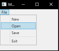 MENU – One of the most common parts of a Windows application is the menu, sometimes referred to as the main menu because only one usually exists in the application. The menu is practical because it offers a lot of options using only very little space, and even though Microsoft is pushing the Ribbon as a replacement for the good, old menu and toolbars, they definitely still have their place in every good developer’s toolbox. WPF comes with a fine control for creating menus called… Menu. Adding items to it is very simple – you simply add MenuItem elements to it, and each MenuItem can have a range of sub-items, allowing you to create hierarchical menus as you know them from a lot of Windows applications. The Header property defines the label of the item. Two common features of a menu item is the icon, used to more easily identify the menu item and what it does, and the ability to have checkable menu items, which can toggle a specific feature on and off. The WPF MenuItem supports both. By setting IsCheckable property of a MenuItem to true makes a menu item to a CheckBox in front of the header text. InputGestureText property is used to add keyboard shortcut to the menu item, like Ctrl+V for Paste. The most important even of a menu is the Click event added to each MenuItem.
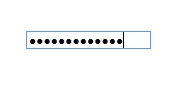 PASSWORDBOX – For editing regular text in WPF we have the TextBox, but what about editing passwords? The functionality is very much the same, but we want WPF to display something else than the actual characters when typing in a password, to shield it from nosy people looking over your shoulder. For this purpose, WPF has the PasswordBox control, which is just as easy to use as the TextBox. You can actually control which character is used instead of the little circles (or asterisks, on some systems) used to hide the real characters, using the PasswordChar property. In case you need to control the length of the password, there’s a MaxLength property available. When you need to obtain the password from the PasswordBox, you can use the Password property from code behind.
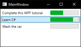
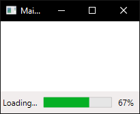
 PROGRESSBAR – WPF comes with a handy control for displaying progress, called the ProgressBar. It works by setting a minimum and maximum value and then incrementing a value, which will give a visual indication on how far in the process you currently are. Another approach is to use actual minimum and maximum values from a list of tasks you’re performing. For instance, if you loop through a collected list of files while checking each of them, you can set the Minimum property to 0, the Maximum to the amount of files in your list, and then just increment as you loop through it. In most situations you will use the ProgressBar to show progress for some heavy/lengthy task, and this this is where most new programmers run into a very common problem: if you do a piece of heavy work on the UI thread while trying to simultaneously update the ProgressBar control, you will soon realize that you can’t do both at the same time, on the same thread. Or to be more clear, you can, but the ProgressBar won’t actually show each update to the progress before the task is completed, which pretty much renders it useless. Instead, we have to perform the task on a worker thread and then push updates to the UI thread, which will then be able to immediately process and visually show these updates. An excellent tool for handling this job is the BackgroundWorker class, which I will talk about later on in this lesson. For some tasks, expressing the progress as a percentage is not possible or you simply don’t know how long it will take. For those situations, the indeterminate progress bar has been invented, where an animation lets the user know that something is happening, while indicating that the running time can’t be determined. The WPF ProgressBar supports this mode through the use of the IsIndeterminate property. The Minimum property sets the minimum value relative to which the ProgressBar starts displaying values. Maximum is obviously the property that sets the maximum value which the ProgressBar can show. Value is the property that actually shows the progress, relative to the Minimum and Maximum values. Orientation is a property which determines how the ProgressBar will be rendered, and can have two values: horizontal and vertical. You will also notice two additional properties, SmallChange and LargeChange; these are actually irrelevant to the ProgressBar control, they are inherited from the ScrollBar control, but Microsoft hasn’t yet bothered to fix this bug. The default event of ProgressBar control is ValueChanged, which occurs whenever the value changes.
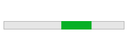
IsIndeterminate True
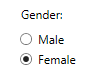 RADIOBUTTON – The RadioButton control allows you to give your user a list of possible options, with only one of them selected at the same time. You can achieve the same effect, using less space, with the ComboBox control, but a set of radio buttons tend to give the user a better overview of the options they have. By default, when you add few RadioButtons to a window, you can only set one of them as checked, using the IsChecked property. Well, what about times when you need more than a set of RadioButtons that are independent one of the others? In such case, you can group together RadioButtons using the GroupName property. Specifying the same name for different RadioButtons will group them together, while still respecting the rule of only one being checked at any given time. The important events of RadioButton are Checked and Unchecked.
RECTANGLE – The Rectangle object represents a rectangle shape and draws a rectangle with the given height and width. The Width and Height properties of the Rectangle class represent the width and height of a rectangle. The Fill property fills the interior of a rectangle. The Stroke property sets the color of the border, while StrokeThickness represents the width of the outer line of a rectangle.
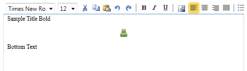 RICHTEXTBOX – So far, we’ve only looked at the read-only wrappers for the FlowDocument, but WPF also includes a control which makes a FlowDocument editable: the RichTextBox control. You can add a RichTextBox directly to the window, without any content – in that case it will automatically create a FlowDocument instance that you will be editing. Alternatively, you can wrap a FlowDocument instance with the RichTextBox and thereby control the initial content. A RichTextBox control hosts a collection of RichTextBoxItem. Because the RichTextBox uses a FlowDocument internally, and because the rich text format is obviously more complicated than plain text, working with text and selections are not quite as easy as for the WPF TextBox control. Instead of accessing a text property directly on the RichTextBox, as you would do with a regular TextBox, you will be using TextRange objects with TextPointer’s from the RichTextBox to obtain text from the control or the selection in the control. This is simply how it works with RichTextBox, which, as already mentioned, doesn’t work like a regular TextBox in several aspects. Another thing you may have noticed when working with the RichTextBox is the fact that when you press Enter to start a new paragraph, this paragraph will leave an empty line between the old and the new paragraph. This is normal behavior for a text editor working in paragraphs, but depending on how and where you use the RichTextBox, it might be confusing for your users that a single Enter press results in such a large amount of space between the lines. Fortunately, it’s very easy to fix. The extra spaces comes from the fact that paragraphs have a default Margin property bigger than zero, so fixing it is as simple as changing this property. A RichTextBox control comes with spell check functionality out-of-the-box, by setting the SpellCheck.IsEnabled property to true. We can use the RichTextBox.Items.Remove or RichTextBox.Items.RemoveAt methods to delete an item from the collection of items in the RichTextBox. The RemoveAt method takes the index of the item in the collection. The biggest advantage of using a RichTextBox over a regular TextBox (which I will present soon) is that it allows a lot of more available options for customizing the formatting of text.
 SCROLLBAR – The XAML Scrollbar element represents a control that provides a scroll bar that has a sliding Thumb whose position corresponds to a value. The Orientation property sets the direction of scrolling that can be either horizontal or vertical. The Value property of ScrollBar sets up the current value of a ScrollBar control. The Minimum and Maximum properties represent the minimum and maximum range of a ScrollBar. SmallChange property determines how far to scroll if the user clicks the arrows at the end of the ScrollBar, while LargeChange determines how much to scroll when the user clicks on the background of the ScrollBar either side of the slider. ValueChanged is the default event of a ScrollBar, and you also have a Scroll event at your disposal.
SCROLLVIEWER – A ScrollViewer scrolls other controls. It is used as a container. We drag (or otherwise add) controls, nesting them inside the ScrollViewer, and then it automatically allows scrolling of the interior area. ScrollViewer is a layout control. It requires you to add controls to it before it is useful. Once you do this, though, you get a region that expands as much as needed. This can lead to more versatile interfaces. The HorizontalScrollBarVisibility and VerticalScrollBarVisibility are two major used properties of ScrollViewer that enables horizontal and vertical scrolling. These properties are represented by a ScrollBarVisibility enumeration that has the four values Auto, Disabled, Hidden and Visible. The Disabled and Hidden values are used to disable and hide scrolling on WPF controls. Visible is used to make it visible all the time. Auto is the most used value, and it makes scrolling visible when it is needed only.
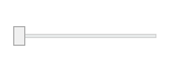
SEPARATOR – The Separator control is used to separate items in items controls. The intention is to divide the items on the menu or toolbar into logical groups. It uses borders and rectangles. It looks like a simple line.
 SLIDER – A Slider is a control with the help of which a user can select from a range of values by moving a Thumb control along a track. The IsFocused property indicates whether the slider control has focus and IsDirectionReversed property represents the direction of increasing value. By default, the slider control sits on UI in horizontal direction. By using the Orientation property, a slider control can be placed vertically. The Value property of Slider sets up the current value of a ScrollBar control. The Minimum and Maximum properties represent the minimum and maximum range of a Slider. By default, the Slider has a TickPlacement property, which is set to None. By setting it to TopLeft, BottomRight or Both, the Slider will display ticks, which are small markers shown on the line to give a better indication on how far the thumb is. TickFrequency property specifies how many ticks should be displayed. The value of the Slider control is a double, meaning that the value can (and will likely) be a non-integer. We can change this by using the IsSnapToTickEnabled property. ValueChanged is the default event of a slider.
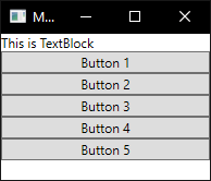 STACKPANEL – A StackPanel places child elements in a vertical or horizontal stack. It is one of the popular panels because of its simplicity. By default, a StackPanel’s child element grows from the top of the panel to the bottom, in other words in vertical orientation. You can control the position of elements using HorizontalAlignment or VerticalAlignment and control the spacing using Margin and Padding properties. The Orientation property can be used to specify the direction of flow, and can be vertical or horizontal. StackPanels are used by ItemsControls like Menu, ListBox, and ComboBox. The StackPanel is very similar to the WrapPanel, but with at least one important difference: The StackPanel doesn’t wrap the content. Instead it stretches its content in one direction.
 STATUSBAR – A StstusBar is used in many applications to report information about the progresss of operations or current state of the software, like cursor position, word count, progress of tasks and so on. Fortunately for us, WPF comes with a nice StatusBar control, making it very easy to add status bar functionality to your applications. A status bar is usually a thin, horizontal strip at the bottom of a window. Sometimes it just shows simple text. For more complex programs, the status bar may be split into many sections containing text, glyphs, progress bars and interactive controls. You can even place other controls than the ones used in these examples, like buttons, combo boxes and so on, but please be aware that since the StatusBar doesn’t apply any special rendering to these controls when hosting them, it might not look as you would expect it to for controls in a status bar. This can be handled with custom styling if you need it.
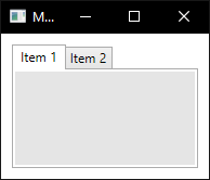 TABCONTROL – The WPF TabControl allows you to split your interface up into different areas, each accessible by clicking on the tab header, usually positioned at the top of the control. Tab controls are commonly used in Windows applications and even within Windows’ own interfaces, like the properties dialog for files/folders etc. Two elements play main roles in building a tab control: TabControl and TabItem. TabControl is the container of one or more TabItem elements. Each TabControl can contain a collection of TabItem elements. TabItem has two specific attributes. Header is the string property that you see on top of each tab and IsSelected is a Boolean value that specifies if a tab is selected. Apparently only one tab can be selected at a time otherwise the first tab in list will be selected. TabStripPlacement is an attribute that lets you to change the position of tab strip (default is Top). There are four attribute of TabStripPlacement: Top, Left, Right and Bottom. Sometimes you may wish to control which tab is selected programmatically or perhaps get some information about the selected tab. The WPF TabControl has several properties which makes this possible, including SelectedIndex and SelectedItem. SelectionChanged is the default event of TabControl.
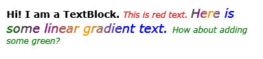
TextBlock with Inline
TEXTBLOCK – TextBlock is not a control, per se, since it doesn’t inherit from the Control class, but it’s used much like any other control in the WPF framework, so I’ll call it a control to keep things simple. The TextBlock control is one of the most fundamental controls in WPF, yet it’s very useful. It allows you to put text on the screen, much like a Label control does, but in a simpler and less resource demanding way. A common understanding is that a Label is for short, one-line texts (but may include e.g. an image), while the TextBlock works very well for multiline strings as well, but can only contain text (strings). Both the Label and the TextBlock offer their own unique advantages, so what you should use very much depends on the situation. TextBlock is perfectly capable of dealing with long, multiline texts, but it will not do anything by default. In this case the text is too long to be rendered inside the window, so WPF renders as much of the text as possible and then just stops. Fortunately, there are several ways of dealing with this: LineBreak is an XAML tag that you can use to manually break the line at a designated location. This gives you absolute control over where you want the text to break onto a new line, but it’s not very flexible for most situations. If the user makes the window bigger, the text will still wrap at the same position, even though there may now be room enough to fit the entire text onto one line; TextTrimming property with the value CharacterEllipsis can make the TextBlock show an ellipsis (…) when it can’t fit any more text into the control. This is a common way of showing that there’s more text, but not enough room to show it. This is great when you have text that might be too long but you absolutely don’t want it to use more than one line. As an alternative to CharacterEllipsis you may use WordEllipsis, which will trim the text at the end of the last possible word instead of the last possible character, preventing that a word is only shown in part; TextWrapping property with the value Wrap makes the TextBlock wrap to the next line whenever it can’t fit anymore text into the previous line. Contrary to the first TextBlock, where we manually define where to wrap the text, this happens completely automatic and even better: it’s also automatically adjusted as soon as the TextBlock get more or less space available. The Inlines property represents the collection of inline text within a TextBlock control. A Run object represents an inline text and can be treated as its own text control and have its foreground and font related properties. The TextDecorations property represents the text decorations that are applied to the content of a TextBlock. WPF supports only underline text decoration.
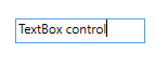 TEXTBOX – The TextBox control is the most basic text-input control found in WPF, allowing the end-user to write plain text, either on a single line, for dialog input, or in multiple lines, like an editor. The TextBox control is such a commonly used thing that you actually don’t have to use any properties on it, to have a full-blown editable text field. Text is the property for setting the actual text. The AcceptsReturn makes the TextBox into a multi-line control by allowing the use of the Enter/Return key to go to the next line, while the TextWrapping property will make the text wrap automatically when the end of a line is reached. As an added bonus, the TextBox control actually comes with automatic spell checking for English and a couple of other languages (as of writing, English, French, German, and Spanish languages are supported). It works much like in Microsoft Word, where spelling errors are underlined and you can right-click it for suggested alternatives. The property that makes this possible is SpellCheck.IsEnabled. Just like any other editable control in Windows, the TextBox allows for selection of text, e.g. to delete an entire word at once or to copy a piece of the text to the clipboard. The WPF TextBox has several properties for working with selected text, all of them which you can read or even modify. We use three interesting properties to accomplish this: SelectionStart, which gives us the current cursor position or if there’s a selection, where it starts; SelectionLength, which gives us the length of the current selection, if any, otherwise it will just return 0; SelectedText, which gives us the currently selected string if there’s a selection, otherwise an empty string is returned. IsReadOnly property determines if the text will be editable by user or not. The default event of TextBox control is TextChanged, which occurs whenever the text inside it changes in any way (this includes undo, backspace, typing, delete, etc).
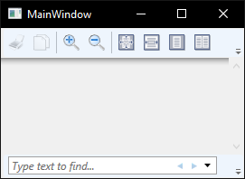
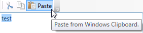 TOOLBAR – The toolbar is a row of commands, usually sitting right below the main menu of a standard Windows application. This could in fact be a simple panel with buttons on it, but by using the WPF ToolBar control, you get some extra goodies like automatic overflow handling and the possibility for the end-user to re-position your toolbars. A WPF ToolBar is usually placed inside of a ToolBarTray control. The ToolBarTray will handle stuff like placement and sizing, and you can have multiple ToolBar controls inside of the ToolBarTray element. While text on the toolbar buttons is perfectly okay, the normal approach is to have icons or at least a combination of an icon and a piece of text. Because WPF uses regular Button controls, adding icons to the toolbar items is very easy. The ToolTip property adds an explanatory text. This is especially important for those buttons with only an icon, because the purpose of the button might not be clear from only looking at the icon. With the ToolTip property, the user can hover the mouse over the button to get a description of what it does. ToolBar.OverflowMode is the property that deals with automatic overflow, and default value is IfNeeded, which simply means that a toolbar item is put in the overflow menu if there’s not enough room for it. You may use Always or Never instead, which does exactly what the names imply: puts the item in the overflow menu all the time or prevents the item from ever being moved to the overflow menu. Orientation property of the ToolBar specifies whether it will be vertically or horizontally oriented.
TOOLBARPANEL – The ToolBar uses a ToolBarPanel and a ToolBarOverflowPanel in its ControlTemplate. The ToolBarPanel is responsible for the layout of the items on the toolbar. The ToolBarOverflowPanel is responsible for the layout of the items that do not fit on the ToolBar.
TOOLBARTRAY – The ToolBarTray class provides a container for the ToolBar control, as I explained earlier. By placing tool bars within a tray, they are automatically given extra features. Toolbars are grouped together, either side by side or one above the other, and the user is given the ability to move them using familiar drag and drop techniques. You can also orientate toolbars vertically instead of horizontally, so that their buttons are organised into a vertical column.
 TREEVIEW – The WPF TreeView can be used in a very simple manner, by adding TreeViewItem objects to it, either from Code-behind or simply by declaring them directly in your XAML. We simply declare the TreeViewItem objects directly in the XAML, in the same structure that we want to display them in, where the first tag is a child of the TreeView control and its child objects are also child tags to its parent object. To specify the text we want displayed for each node, we use the Header property. IsExpanded property specifies whether an item is expanded or not. ItemSource property can be used to databind the TreeView from the code behind. TreeViewItem has, among others, Selected, Unselected, Expanded and Collapsed events.
VIEWBOX – The ViewBox is a very useful control in WPF. It does nothing more than scale to fit the content to the available size. It does not resize the content, but it transforms it. This means that also all text sizes and line widths were scaled. Its about the same behavior as if you set the Stretch property on an Image or Path to Uniform. Although it can be used to fit any type of control, it’s often used for 2D graphics, or to fit a scalable part of a user interface into an screen area. The Stretch property defines this behavior and has following options available: Fill, Uniform, UniformToFill.
 WEBBROWSER – WPF comes with a ready to use WebBrowser control, which allows you to host a complete web browser within your application. The WebBrowser control is really just a shell around an ActiveX version of Internet Explorer, but since this is an integrated part of Windows, your application should work on all Windows machines without requiring the installation of additional components. The WebBrowser can access the network to download a web page. But it can also directly open a file on your local computer. This is done also with the Navigate method, by using the “file” scheme instead of “http”. There are various properties of WebBrowser control, such as Source, which sets the current displayed document, IsLoaded, CanGoBack, CanGoForward, etc. You can also use methods such as Navigate(), GoBack() or Refresh(). WebBrowser control’s most important events are Navigating, LoadCompleted, Navigated, etc.
WINDOWSFORMSHOST – WPF and WinForms are two distinct UI frameworks, as I have previously explained. WPF is meant as a more modern alternative to WinForms, which was the first .NET UI framework. To lighten the transition between the two, Microsoft has made sure that WinForms controls may still be used inside of a WPF application. This is done with the WindowsFormsHost, which is a WPF container control that can host a WinForms control. To use the WindowsFormsHost and controls from WinForms, you need to add a reference to the following assemblies in your application: WindowsFormsIntegration and System.Windows.Forms. I strongly advice against using WinForms controls, so I won’t be explaining the usage of this WPF control in detail. Use it only if you have legacy WinForms controls that you cannot re-create in WPF, or if you don’t have any other way.
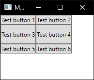 WRAPPANEL – The WrapPanel will position each of its child controls next to the other, horizontally (default) or vertically, until there is no more room, where it will wrap to the next line and then continue. Use it when you want a vertical or horizontal list controls that automatically wraps when there’s no more room. When the WrapPanel uses the Horizontal orientation, the child controls will be given the same height, based on the tallest item. When the WrapPanel is the Vertical orientation, the child controls will be given the same width, based on the widest item.
Tags: controls, graphical user interface, GUI, visual studio interface