At some point in my lessons, I was discussing how a class (object) can have properties and methods. I was also saying that the Controls that we are adding to our GUI’s are actually also objects (classes). Therefor, as you might have guessed, the graphical controls of our interfaces have control properties, through which we can customize their parameters.
In the previous lesson, we wrote this particular line of XAML:
<Label Content="We have created a new label!" Height="30" Margin="185, 177, 201, 112"/>
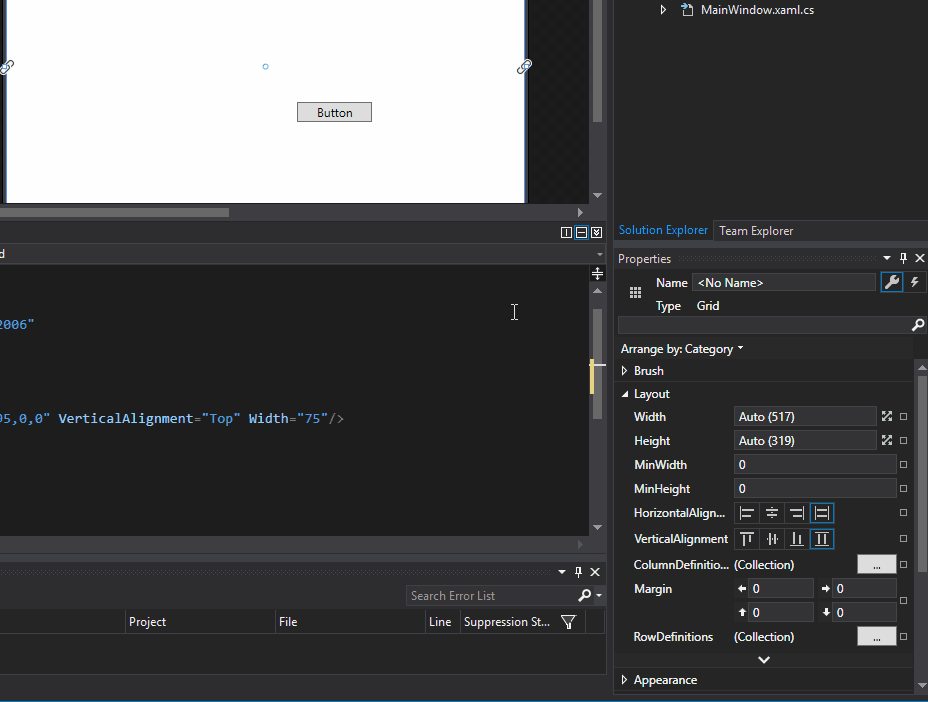
You might not have known it at the time, but every parameter followed by the assignment operator = is actually a property of our Label control. In other words, we can say that our Label control has a few control properties, like Height, Margin or Content. We can set these properties in XAML code, like we did yesterday, or we can set them using the Properties panel of Visual Studio, located on the right side (make sure you select the control in the visual designer first!):

You can notice by browsing through various expandable categories of the properties panel that you can set a huge selection of control properties. This is one of the reasons why I said that WPF/XAML lets you create much more customizable interfaces than Windows Forms. And the good news? You can customize your controls even more, through advanced XAML codes, if you so desire!
You should probably know that being an object, any visual control can also be created in code, not only visually. This also means that we can set the properties of visual controls through C# code, but this would either require a run-time created control, or a way of identifying the control in code, using a x:Name XAML statement.
Here is an example of a control created in code, to which we also set a few properties, also in code:
using System.Windows;
using System.Windows.Controls;
using System.Windows.Media;
namespace HelloWorldWPF
{
public partial class MainWindow : Window
{
public MainWindow()
{
InitializeComponent();
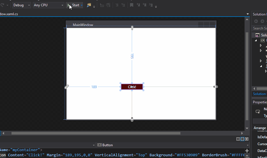
Button newButton = new Button(); //remember instantiation of classes?
newButton.Height = 100; //set some control properties
newButton.Width = 300;
newButton.Margin = new Thickness(189, 195, 0, 0);
newButton.Background = Brushes.Red;
newButton.Foreground = Brushes.White;
newButton.BorderBrush = Brushes.Pink;
newButton.HorizontalAlignment = HorizontalAlignment.Left;
newButton.VerticalAlignment = VerticalAlignment.Top;
newButton.Content = "Click me!";
myContainer.Children.Add(newButton); //add our button as a children to myContainer
}
}
}
Aside of the fact that we are creating a new control in the above piece of code, you can notice two things: first, we are using the using System.Windows.Controls; statement. This should indicate to us that the XAML controls we have been adding to our visual designer, or the ones we are adding through code now, they are all declared inside System.Windows.Controls namespace. Also, we should notice that after creating our control, we are using the line myContainer.Children.Add(newButton);. What does that mean?
It means that when we are instantiating a new copy of the Button class, and we are setting its properties, like Height, Content, etc, we are only creating that instance in memory. It is not yet added to any visual hierarchy, as I explained in a previous lesson that XAML requires a hierarchy parent-children design style. In other words, we are creating a new button, but after we create it, we also need to make sure that we are adding it to our XAML design, as children of some control. In our case, we are adding it as children of our Grid. But since there could be more than one Grid, how do we tell the compiler which Grid we meant to specify as parent?
In such cases, as i explained earlier, we need to specify a x:Name XAML attribute to the control we need to identify in code. In other words, our XAML should be changed like this:
<Window x:Class="HelloWorldWPF.MainWindow"
        xmlns="http://schemas.microsoft.com/winfx/2006/xaml/presentation"
        xmlns:x="http://schemas.microsoft.com/winfx/2006/xaml"
        xmlns:d="http://schemas.microsoft.com/expression/blend/2008"
        xmlns:mc="http://schemas.openxmlformats.org/markup-compatibility/2006"
        xmlns:local="clr-namespace:HelloWorldWPF"
        mc:Ignorable="d"
        Title="MainWindow" Height="350" Width="525" WindowStartupLocation="CenterScreen">
    <Grid x:Name="myContainer">

    </Grid>
</Window>
In short, we have a window and a Grid. Nothing new. The only visible difference we notice is that we used x:Name=”myContainer” on our Grid, meaning that we named our Grid myContainer. This is the reason why in C# we could write this line:
myContainer.Children.Add(newButton);
Because we named our Grid, we can use that name in our C# codes to specify that particular Grid.
When you run the above program, even if the Grid contains no children in our XAML codes, you will be surprised to see that when you execute it, the program will display a button inside our Grid. This button is the Button instance we have created and added to our Grid, in code.
To summarize, we can edit the properties of our controls in three ways: in the Properties panel of Visual Studio, in XAML code or in C# code, after we give a specific name to the control, so we can identify it in code.
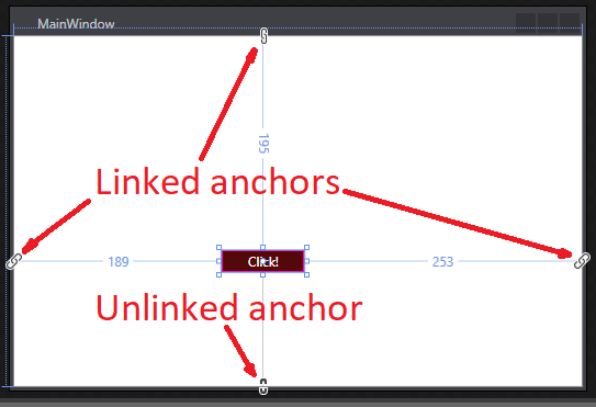
One important property of controls is what is called anchoring. Anchoring is the concept that describes the behavior of a control when we resize its parent container. In other words, if we have a button of 100 pixels width, but we resize the window containing it, how should that button behave? Should it remain 100 pixels? Should it resize along with the window? Anchors describe which edges of a control should be “anchored” to the edges of its parent control. In Visual Studio designer, control anchors are some special graphic symbols that look like this:
Now, lets see the the different behavior of controls with different anchoring:
As you can see, anchoring an edge of a control to the edge of its parent will make that control keep the distance between its edge and the anchored edge, effectively resizing itself.
Tags: controls, graphical user interface, GUI, properties, XAML

